Archive for December, 2017
More than a dozen people were injured when a car “deliberately” plows pedestrians outside Melbourne’s iconic Flinders Street station j
Thursday, December 21st, 2017Venezuela: Doctors at 21 public hospitals in 17 states across the country said that their ERs were being overwhelmed by children with severe malnutrition
Thursday, December 21st, 2017A review of a mobile mass shooting in Kalamazoo
Thursday, December 21st, 2017Frank Straub, Ph.D., Brett Cowell, Jennifer Zeunik, and Ben Gorban. Managing the Response to a Mobile Mass Shooting. April 2017. Washington, DC: Police Foundation.
- “…..The sequence of events that began Saturday afternoon with the suspect driving recklessly in and around the streets of Kalamazoo, ultimately ended with his arrest early Sunday morning. During that time, he allegedly shot eight people, killing six and severely wounding two, across three separate locations in and around the city…..”
Pneumonic Plague in Johannesburg, South Africa, 1904
Thursday, December 21st, 2017Volume 24, Number 1—January 2018
Historical Review
Evans CM, Egan JR, Hall I. Pneumonic Plague in Johannesburg, South Africa, 1904. Emerg Infect Dis. 2018;24(1):95-102. https://dx.doi.org/10.3201/eid2401.161817
Pneumonic Plague in Johannesburg, South Africa, 1904
Figure 3

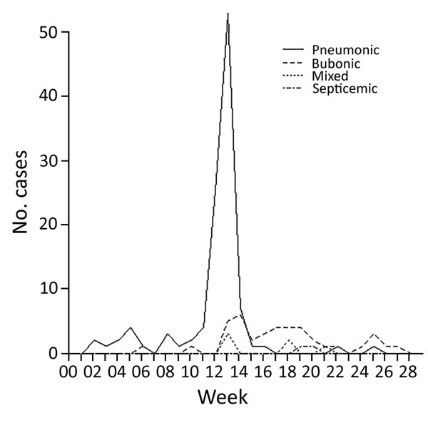
Figure 3. Incidence of the 4 types of plague over the duration of the epidemic in Johannesburg, South Africa, from week ending January 2 to week ending June 16, 1904.
Figure 4

Figure 4. A) Deaths per day resulting from primary pneumonic plague in Johannesburg, South Africa, March 7–31, 1904. B) Back-calculated number of case-patients experiencing symptom onset. Circles represent most likely values; error bars represent 95% CIs. C) Transmissibility of primary pneumonic plague as measured by reproduction number, Rt. Circles represent the most likely values, error bars represent 95% CIs, and shaded polygons represent the period over which Rt was estimated. Uncertainty in the back-calculated incidence has not been accounted for in the transmission estimates, which means that the variations in the time-varying Rt are probably underestimated because the incidence curve is smoothed out somewhat by the back-calculation process (and also reduced slightly because of rounding to the nearest integer). However, because the 7-day sliding window has the effect of smoothing out the Rt estimates in any case, not accounting for the uncertainty in the back-calculation probably has a limited effect on panel C results.
South Korean sources: Pyongyang is conducting heat and pressure resistance tests to see whether anthrax germs can survive at temperatures of 7,000 degrees or higher, the level an ICBM encounters when it re-enters Earth’s atmosphere.
Wednesday, December 20th, 2017Global Temperatures Over the Decades
Wednesday, December 20th, 2017
1885-1894

1895-1904

1905-1914

1915-1924

1925-1934

1935-1944

1945-1954

1955-1964

1965-1974

1975-1984

1985-1994

1995-2004

2005-2014
The world is getting warmer. Whether the cause is human activity or natural variability—and the preponderance of evidence says it’s humans—thermometer readings all around the world have risen steadily since the beginning of the Industrial Revolution. (Click on bullets above to step through the decades.)
According to an ongoing temperature analysis conducted by scientists at NASA’s Goddard Institute for Space Studies (GISS), the average global temperature on Earth has increased by about 0.8° Celsius (1.4° Fahrenheit) since 1880. Two-thirds of the warming has occurred since 1975, at a rate of roughly 0.15-0.20°C per decade.
But why should we care about one degree of warming? After all, the temperature fluctuates by many degrees every day where we live.
The global temperature record represents an average over the entire surface of the planet. The temperatures we experience locally and in short periods can fluctuate significantly due to predictable cyclical events (night and day, summer and winter) and hard-to-predict wind and precipitation patterns. But the global temperature mainly depends on how much energy the planet receives from the Sun and how much it radiates back into space—quantities that change very little. The amount of energy radiated by the Earth depends significantly on the chemical composition of the atmosphere, particularly the amount of heat-trapping greenhouse gases.
A one-degree global change is significant because it takes a vast amount of heat to warm all the oceans, atmosphere, and land by that much. In the past, a one- to two-degree drop was all it took to plunge the Earth into the Little Ice Age. A five-degree drop was enough to bury a large part of North America under a towering mass of ice 20,000 years ago.
The maps above show temperature anomalies, or changes, not absolute temperature. They depict how much various regions of the world have warmed or cooled when compared with a base period of 1951-1980. (The global mean surface air temperature for that period was estimated to be 14°C (57°F), with an uncertainty of several tenths of a degree.) In other words, the maps show how much warmer or colder a region is compared to the norm for that region from 1951-1980.
Global temperature records start around 1880 because observations did not sufficiently cover enough of the planet prior to that time. The period of 1951-1980 was chosen largely because the U.S. National Weather Service uses a three-decade period to define “normal” or average temperature. The GISS temperature analysis effort began around 1980, so the most recent 30 years was 1951-1980. It is also a period when many of today’s adults grew up, so it is a common reference that many people can remember.
The line plot below shows yearly temperature anomalies from 1880 to 2014 as recorded by NASA, NOAA, the Japan Meteorological Agency, and the Met Office Hadley Centre (United Kingdom). Though there are minor variations from year to year, all four records show peaks and valleys in sync with each other. All show rapid warming in the past few decades, and all show the last decade as the warmest.

To conduct its analysis, GISS uses publicly available data from 6,300 meteorological stations around the world; ship- and buoy-based observations of sea surface temperature; and Antarctic research station measurements. These three data sets are loaded into a computer analysis program—available for public download from the GISS web site—that calculates trends in temperature anomalies relative to the average temperature for the same month during 1951-1980.
The objective, according to GISS scientists, is to provide an estimate of temperature change that could be compared with predictions of global climate change in response to atmospheric carbon dioxide, aerosols, and changes in solar activity.
As the maps show, global warming doesn’t mean temperatures rose everywhere at every time by one degree. Temperatures in a given year or decade might rise 5 degrees in one region and drop 2 degrees in another. Exceptionally cold winters in one region might be followed by exceptionally warm summers. Or a cold winter in one area might be balanced by an extremely warm winter in another part of the globe.
Generally, warming is greater over land than over the oceans because water is slower to absorb and release heat (thermal inertia). Warming may also differ substantially within specific land masses and ocean basins. The graph below shows the long-term temperature trends in relation to El Niño or La Niña events, which can skew temperatures warmer or colder in any one year. Orange bars represent global temperature anomalies in El Niño years, with the red line showing the longer trend. Blue bars depict La Niña years, with a blue line showing the trend. Neutral years are shown in gray, and the black line shows the overall temperature trend since 1950.

Since the year 2000, land temperature changes are 50 percent greater in the United States than ocean temperature changes; two to three times greater in Eurasia; and three to four times greater in the Arctic and the Antarctic Peninsula. Warming of the ocean surface has been largest over the Arctic Ocean, second largest over the Indian and Western Pacific Oceans, and third largest over most of the Atlantic Ocean.
In the global maps at the top of this page, the years from 1885 to 1945 tend to appear cooler (more blues than reds), growing less cool as we move toward the 1950s. Decades within the base period do not appear particularly warm or cold because they are the standard against which all decades are measured. The leveling off between the 1940s and 1970s may be explained by natural variability and possibly by cooling effects of aerosols generated by the rapid economic growth after World War II.
Fossil fuel use also increased in the post-War era (5 percent per year), boosting greenhouse gases. But aerosol cooling is more immediate, while greenhouse gases accumulate slowly and take much longer to leave the atmosphere. The strong warming trend of the past three decades likely reflects a shift from comparable aerosol and greenhouse gas effects to a predominance of greenhouse gases, as aerosols were curbed by pollution controls, according to GISS director Jim Hansen.
-
References
- Hansen, J., R. Ruedy, M. Sato, and K. Lo (2010). Global surface temperature change. Reviews of Geophysics, 48 (RG4004)
- National Academy of Sciences (2010). Advancing the Science of Climate Change. Accessed December 1, 2010.
- NASA (2010, January 21). 2009: Second Warmest Year on Record; End of Warmest Decade. Accessed November 30, 2010.
- NASA (2010, January 21). NASA Climatologist Gavin Schmidt Discusses the Surface Temperature Record. Accessed November 30, 2010.
- NASA Earth Observatory (2010, June 3) Fact Sheet: Global Warming. November 30, 2010.
- NASA Goddard Institute for Space Studies (n.d.). GISS Surface Temperature Analysis. Accessed November 30, 2010.
- NOAA National Climatic Data Center (n.d.). Global Warming Frequently Asked Questions. Accessed December 1, 2010.
- NOAA Paleoclimatology. (n.d.) Climate Timeline Tool: Climate Resources for 1000 Years. Accessed December 1, 2010.
NASA: Thomas Fire’s impact on air quality
Wednesday, December 20th, 2017
After more than a week of burning, the wildfires in Southern California continue to loft a nasty mixture of aerosols and gases into the atmosphere.
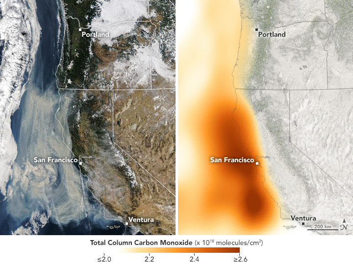
On December 11, 2017, the Moderate Resolution Imaging Spectroradiometer (MODIS) on NASA’s Aqua satellite acquired a natural color image (left) of smoke billowing from the Thomas Fire in Ventura County, California. By that day, the fire had already burned 230,500 acres (93,000 hectares or 360 square miles).
The corresponding map (right) shows the concentration of carbon monoxide in the area, based on data collected by the Atmospheric Infrared Sounder (AIRS) on Aqua. The concentrations reflect total “column” amounts of the gas, measured vertically through the atmosphere by AIRS. Orange areas indicate the highest concentrations of carbon monoxide.
When fires burn through a fuel source—such as vegetation, gasoline, or coal—emissions can include everything from hydrocarbons, nitrogen oxides, and carbon monoxide. Close to the source of the fire, the air quality on that day was rated unhealthy. As the image pair shows, smoke and carbon monoxide appear offshore as well.
Dejian Fu, an atmospheric scientist at NASA’s Jet Propulsion Laboratory, thinks that the carbon monoxide plume likely stemmed from the burning onshore and then blew out over the Pacific Ocean. This map shows the gas concentration up to an altitude of about 5 kilometers above the surface.
Carbon monoxide contributes to reactions that produce ground-level ozone, a harmful pollutant. It can also make breathing difficult to dangerous when trapped near the ground.
-
References and Further Reading
- NASA Earth Observatory (2017, December 11) Fires Continue to Rage in Southern California.
- NASA Earth Observatory (2000, March) Fire & Carbon Monoxide.
NASA Earth Observatory images by Joshua Stevens, using MODIS data from LANCE/EOSDIS Rapid Response and AIRS data from the Goddard Earth Sciences Data and Information Services Center (GES DISC). Story by Kathryn Hansen.
The Thomas fire: The 2nd largest in modern California history (272,000 acres)
Wednesday, December 20th, 2017
Fire Information Report for Thomas
Report Date: 20-DEC-17
| Burnt Area: | 271,000 Acres |
| Location: | Ventura County, California |
| Cause: | Undetermined |
| Incident Team Type: | IMT Type 1 |
| Containment Status: | 55% contained |
| Expected Containment: | 07-Jan-18 |
Etymologia: Plague
Wednesday, December 20th, 2017Henry R. Etymologia: Plague. Emerg Infect Dis. 2018;24(1):102. https://dx.doi.org/10.3201/eid2401.ET2401
Plague (from the Latin plaga, “stroke” or “wound”) infections are believed to have been common since at least 3000 bce. Plague is caused by the ancestor of current Yersinia (named for Swiss bacteriologist Alexandre Yersin, who first isolated the bacterium) pestis strains (Figure 1). However, this ancestral Y. pestis lacked the critical Yersinia murine toxin (ymt) gene that enables vectorborne transmission. After acquiring this gene (sometime during 1600–950 bce), which encodes a phospholipase D that protects the bacterium inside the flea gut, Y. pestis evolved the ability to cause pandemics of bubonic plague. The first recoded of these, the Justinian Plague, began in 541 ace and eventually killed more than 25 million persons (Figure 2)
Figure 1

Figure 1. Digitally colorized scanning electron microscopic image of a flea. Fleas are known to carry a number of diseases that are transferable to humans through their bites, including plague, caused by the bacterium Yersinia pestis. Photo: Centers for Disease Control and Prevention (CDC), Janice Haney Carr.
Figure 2

Figure 2. Plague warning signs posted in regions where plague has been discovered. In remote areas with little human habitation, the most appropriate action may be to post signs on the roads entering the epizootic area to warn people, and provide information on personal protection and plague prevention. Photo, CDC, 1993.
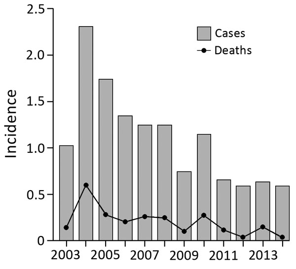
The overall death rate from melioidosis in Singapore was 18.4%, similar to that in the Northern Territory of Australia (14%).
Wednesday, December 20th, 2017Pang L, Harris P, Seiler RL, Ooi P, Cutter J, Goh K, et al. Melioidosis, Singapore, 2003–2014. Emerg Infect Dis. 2018;24(1):140-143. https://dx.doi.org/10.3201/eid2401.161449
Demographic characteristics of patients with melioidosis, Singapore, 2003–2014*
| Characteristic | 2003 | 2004 | 2005 | 2006 | 2007 | 2008 | 2009 | 2010 | 2011 | 2012 | 2013 | 2014 | Total (%)† |
|---|---|---|---|---|---|---|---|---|---|---|---|---|---|
| No. cases
|
42
|
96
|
74
|
59
|
57
|
60
|
37
|
58
|
34
|
31
|
34
|
32
|
614 |


