Archive for the ‘NASA’ Category
NASA: New Delhi in 1989 and 2018
Tuesday, October 2nd, 2018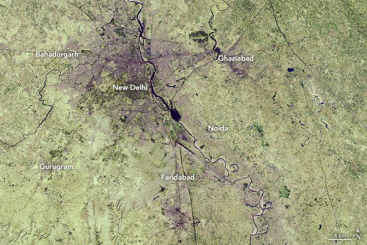

The capital of India, New Delhi, has been experiencing one of the fastest urban expansions in the world. Vast areas of croplands and grasslands are being turned into streets, buildings, and parking lots, attracting an unprecedented amount of new residents. By 2050, the United Nations projects India will add 400 million urban dwellers, which would be the largest urban migration in the world for the thirty-two year period.
These images show the growth in the city of New Delhi and its adjacent areas—a territory collectively known as Delhi—from December 5, 1989, (left) to June 5, 2018 (right). These false-color images use a combination of visible and short-wave infrared light to make it easier to distinguish urban areas. The 1989 image was acquired by the Thematic Mapper on Landsat 5 (bands 7,5,3), and the 2018 image was acquired by Operational Land Imager on Landsat 8 (bands 7,6,4).
Most of the expansion in Delhi has occurred on the peripheries of New Delhi, as rural areas have become more urban. The geographic size of Delhi has almost doubled from 1991 to 2011, with the number of urban households doubling while the number of rural houses declined by half. Cities outside of Delhi—Bahadurgarh, Ghaziabad, Noida, Faridabad, and Gurugram—have also experienced urban growth over the past three decades, as shown in these images.
With a flourishing service economy, Delhi is a draw for migrants because it has one of India’s highest per capita incomes. According to the latest census data, most people (and their families) move into the city for work. The Times of India reported that the nation’s capital grew by nearly 1,000 people each day in 2016, of which 300 moved into the city. By 2028, New Delhi is expected to surpass Tokyo as the most populous city in the world.
The increased urbanization has had several consequences. One is that the temperatures of the urban areas are often hotter than surrounding vegetated areas. Manmade structures absorb the heat and then radiate that into the air at night, increasing the local temperature (the urban heat island effect). Research has shown that densely built parts of Delhi can be 7°C (45°F) to 9°C (48°F) warmer in the wintertime than undeveloped regions.
Additionally, sprawling cities can have several environmental consequences, such as increasing traffic congestion, greenhouse gas emissions, and air pollution. From 2005 to 2014, NASA scientists have observed an increase in air pollution in India due to the country’s fast-growing economies and expanding industry.
India is one of many countries with fast-growing cities. By 2050, China is projected to add 250 million people in its urban areas, and Nigeria may add 190 million urban dwellers. In total, India, China and Nigeria are expected to account for 35 percent of the world’s urban population growth between 2018 and 2050.
NASA Earth Observatory images by Lauren Dauphin, using Landsat data from the U.S. Geological Survey. Story by Kasha Patel.
NASA: How temperatures are changing the force of Florence
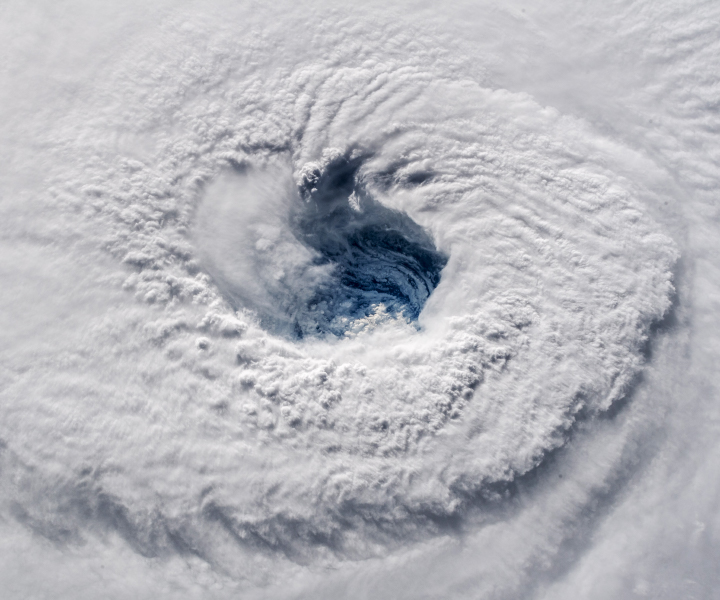
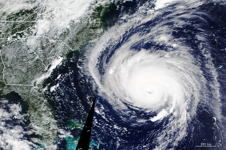
Thursday, September 13th, 2018As millions of people along the Atlantic Coast of the United States board up windows and evacuate before Hurricane Florence makes landfall, remote sensing researchers and forecasters are monitoring the environmental conditions fueling the powerful storm. They are assembling a suite of satellite images and data products that could aid storm preparedness and recovery efforts by federal and local partners.
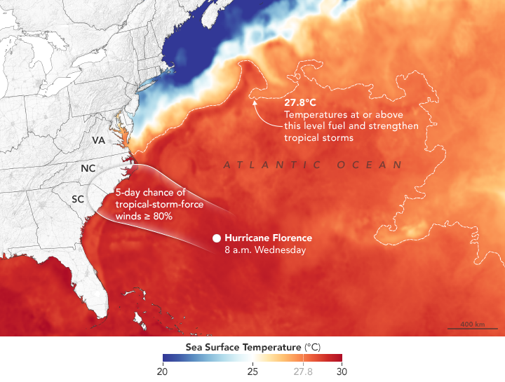
As Florence approaches land, two key factors will help govern the severity of the storm: ocean temperatures and wind shear, the difference in wind speeds at upper and lower parts of a storm. Warm ocean water and low wind shear are required to sustain and intensify a hurricane.
The map above shows sea surface temperatures on September 11, 2018. Meteorologists generally agree that sea surface temperatures (SSTs) should be above 27.8°C (82°F) to sustain and intensify hurricanes (although there are some exceptions). In Florence’s case, National Hurricane Center forecasters expect the storm to pass over water with temperatures well above that threshold. The data for the map were compiled by Coral Reef Watch, which blends observations from the Suomi NPP, MTSAT, Meteosat, and GOES satellites and computer models. Information about the storm track and winds come from the National Hurricane Center.
Florence will be traveling over water that is anomalously warm for this time of year, noted Marangelly Fuentes, a NASA atmospheric scientist who has been tracking the storm with models maintained by NASA’s Global Modeling and Assimilation Office (GMAO). As the storm approaches land, sea surface temperatures off of the Carolinas were between 0.5 and 1.5 degrees Celsius warmer than usual.
However, the warm coastal water is not the only reason that the Carolinas may be hit by one of the strongest hurricanes to ever make landfall at such a northerly latitude in this region.“While it is common to see storms this strong or even stronger over the ocean at this latitude,” said Gary Partyka, another atmospheric scientist with GMAO. “What set this situation apart was an unusually strong blocking high north of the storm that directed it towards the United States. Usually with storms at this latitude large-scale circulation patterns drive them to the north and east, well away from the coast.”
Forecasters have warned that life-threatening storm surges, catastrophic flooding, damaging winds, and dangerous rip currents will likely occur along the coastlines of North Carolina, South Carolina, and Virginia when the storm arrives late on September 13. There is growing concern that the presence of another atmospheric blocking ridge in the Mid-Atlantic region may cause the storm to stall and possibly move south and west toward Georgia, potentially extending the amount of time it remains over warm water and increasing the rainfall totals.
With forecasters expecting prodigious amounts of rain, NASA’s Disasters Program has mobilized a team that will use NASA sensors to monitor soil moisture, soil saturation, and rainfall rates. During and after the storm, this team will produce and disseminate information about where satellites observe floods and other effects of the storm. For more awesome, frightening views of Hurricane Florence, see this story.
NASA Earth Observatory image by Joshua Stevens, using sea surface temperature data from Coral Reef Watch and wind probabilities from the National Hurricane Center. Story by Adam Voiland.
NASA: Tropical cyclones and storms in the Atlantic
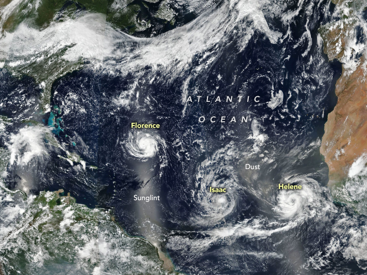
Tuesday, September 11th, 2018The Atlantic basin was relatively quiet for much of August 2018, but September brought a surge in storm activity. On September 9, 2018, Florence, Isaac, and Helene were all churning up the North Atlantic. The trio of storms is visible in this image acquired by the Visible Infrared Imaging Radiometer Suite (VIIRS) on the Suomi NPP satellite.
Category 4 Hurricane Florence was the most ominous for people in the United States. Forecasters at the National Hurricane Center expect the slow-moving storm to reach the coast of the Carolinas on September 12 or 13, bringing a life-threatening storm surge, exceptionally heavy inland rains, and damaging winds. Though weakening, Category 1 Hurricane Isaac is on a path to cross the Lesser Antilles islands and move into the eastern Caribbean Sea on September 13. Category 2 Hurricane Helene was strengthening, but is expected to veer northward into the open ocean.
The bright strips in the image are reflected sunlight, or “glint,” which can show up over ocean areas in the middle of each orbit.
NASA Earth Observatory image by Joshua Stevens, using VIIRS data from the Suomi National Polar-orbiting Partnership. Caption by Adam Voiland.
NASA: Wildfires Blanket Western States With Smoke
Friday, August 3rd, 2018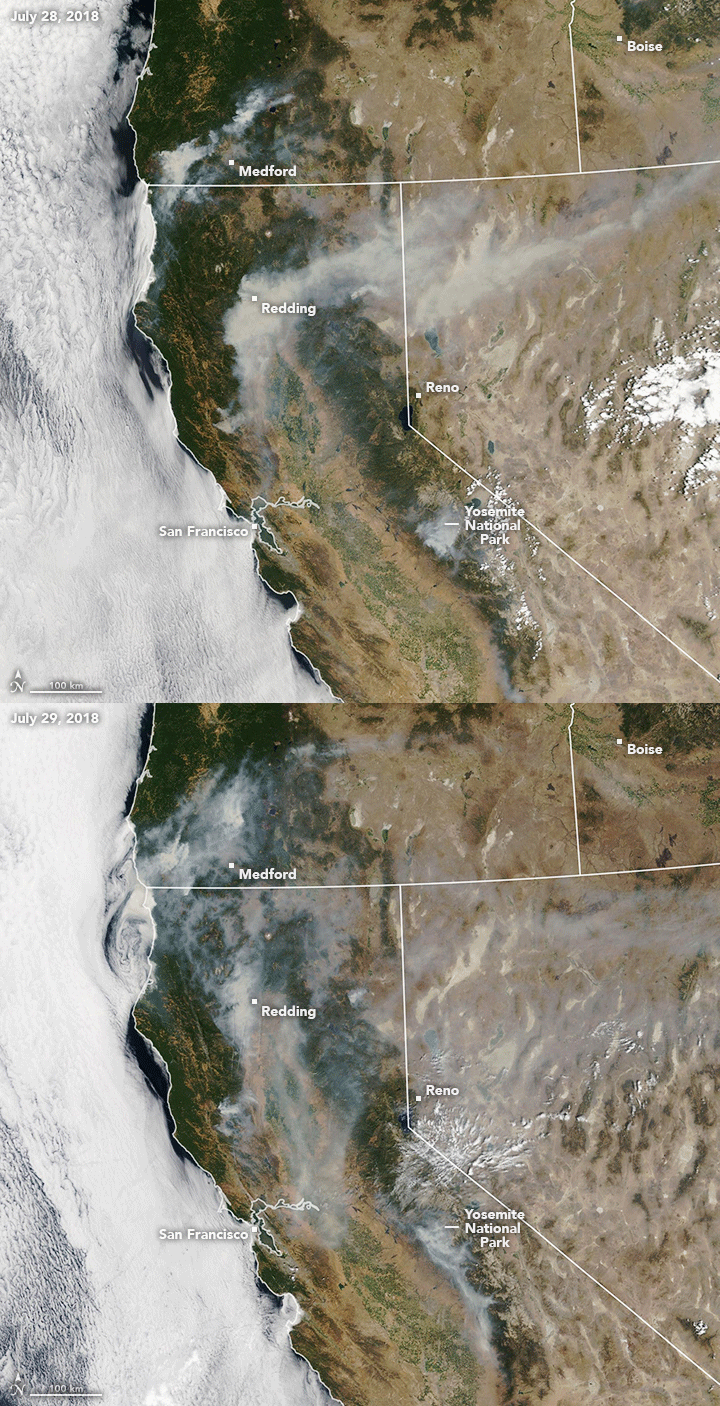
The 2018 wildfire season in North America is well under way, with blazes having burned more acres than average through the end of July. Earlier in the summer, satellite images showed smoke and burn scars from fires in western states including California and Colorado. As the calendar turns to August, smoke is now streaming from fires in nearly every western state.
The Moderate Resolution Imaging Spectroradiometer (MODIS) on NASA’s Terra and Aqua satellites acquired these natural-color images on July 28 and 29. The animation shows how winds can make smoke plumes vary daily in direction and distance from their source.
A notable amount of the smoke stems from the Carr Fire, which is burning in Shasta County near Redding, California. The fire ignited on July 23 amid warm, dry conditions. By July 30, it had burned 98,724 acres and was just 20 percent contained, according to Cal Fire. News reports noted that shifting, gusty winds and a lack of rain in the forecast could worsen the situation.
Other states also contributed to the smoke pall over the West. According to the National Interagency Fire Center, 98 large active fires were burning across the United States on July 30, having consumed 1.2 million acres. States with the largest fires counts included Oregon (16), Alaska (15), Arizona (10), Colorado (13), and California (9).
Most areas of burning land are not directly visible in satellite imagery, obscured from view by smoke and clouds. The Perry Fire in Nevada is an exception; check out these Landsat images to see how the fire advanced over the span of a day.
NASA Earth Observatory images by Lauren Dauphin, using MODIS data from LANCE/EOSDIS Rapid Response. Story by Kathryn Hansen.
NASA: Volcán de Fuego
Thursday, June 14th, 2018Fuego in Guatemala is one of Central America’s most active volcanoes. For years, the towering Volcán de Fuego has puffed continuously, punctuated by occasional episodes of explosive activity, big ash plumes, lava flows, and avalanche-like debris slides known as pyroclastic flows.
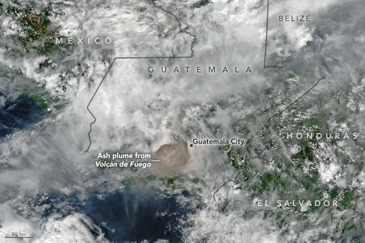
Just before noon on June 3, 2018, the volcano produced an explosive eruption that sent ash billowing thousands of meters into the air. A deadly mixture of ash, rock fragments, and hot gases rushed down ravines and stream channels on the sides of the volcano. Since these pyroclastic flows often move at speeds of greater than 80 kilometers (50 miles) per hour, they easily topple trees, homes, or anything else in their path. According to news reports, more than two dozen people were killed. As a precautionary measure, thousands of other people have been evacuated.
The Visible Infrared Imaging Radiometer Suite (VIIRS) on Suomi NPP acquired this image of the ash plume at 1 p.m. local time (19:00 Universal Time) on June 3, 2018, after the ash (brown) had punched through a deck of clouds. A report from the Washington Volcanic Ash Advisory Center estimated the plume’s maximum height at 15 kilometers (9 miles). Imagery from a geostationary satellite showed winds blowing the plume to the east. The eruption deposited ash on several communities surrounding the volcano, including Guatemala City, which is 70 kilometers (40 miles) to the east.
In addition to ash, the plume contains gaseous components invisible to the human eye, including sulfur dioxide (SO2). The gas can affect human health—irritating the nose and throat when breathed in—and reacts with water vapor to produce acid rain. Sulfur dioxide also can react in the atmosphere to form aerosol particles, which can contribute to outbreaks of haze and sometimes cool the climate.
Satellite sensors such as the Atmospheric Infrared Sounder (AIRS) on the Aqua satellite and the Ozone Mapping Profiler Suite (OMPS) on Suomi NPP make frequent observations of sulfur dioxide. The map above shows concentrations of sulfur dioxide in the middle troposphere at an altitude of 8 kilometers (5 miles) as detected by OMPS on June 3.
Upon seeing data collected by AIRS several hours after the eruption that showed high levels of sulfur dioxide in the upper troposphere, Michigan Tech volcanologist Simon Carn tweeted that this appeared to be the “highest sulfur dioxide loading measured in a Fuego eruption in the satellite era.”
-
References
- Discover (2018, June 4) Rocky Planet: Deadliest Eruption of 2018. Accessed June 4, 2018.
- NASA Global Sulfur Dioxide Monitoring Home Page. Accessed June 4, 2018.
- Smithsonian Institution Global Volcanism Program (2018) Fuego. Accessed June 4, 2018.
- The New York Times (2018, June 4) Guatemala’s Fuego Volcano Erupts, Killing at Least 33. Accessed June 4, 2018.
- U.S. Geological Survey Pyroclastic flows move fast and destroy everything in their path. Accessed June 4, 2018.
- Volcano Discovery (2018, June 4) Fuego volcano news & eruption update. Accessed June 4, 2018.
NASA Earth Observatory images by Joshua Stevens, using VIIRS data from the Suomi National Polar-orbiting Partnership and OMPS data from the Goddard Earth Sciences Data and Information Services Center (GES DISC). Story by Adam Voiland.
- Instrument(s):
- Suomi NPP – VIIRS
- Suomi NPP – OMPS
NASA captures deadly eruption in Guatemala
Sunday, June 10th, 2018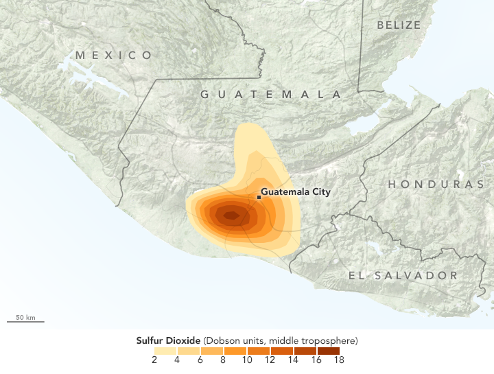
Fuego in Guatemala is one of Central America’s most active volcanoes. For years, the towering Volcán de Fuego has puffed continuously, punctuated by occasional episodes of explosive activity, big ash plumes, lava flows, and avalanche-like debris slides known as pyroclastic flows.
Just before noon on June 3, 2018, the volcano produced an explosive eruption that sent ash billowing thousands of meters into the air. A deadly mixture of ash, rock fragments, and hot gases rushed down ravines and stream channels on the sides of the volcano. Since these pyroclastic flows often move at speeds of greater than 80 kilometers (50 miles) per hour, they easily topple trees, homes, or anything else in their path. According to news reports, more than two dozen people were killed. As a precautionary measure, thousands of other people have been evacuated.
The Visible Infrared Imaging Radiometer Suite (VIIRS) on Suomi NPP acquired this image of the ash plume at 1 p.m. local time (19:00 Universal Time) on June 3, 2018, after the ash (brown) had punched through a deck of clouds. A report from the Washington Volcanic Ash Advisory Center estimated the plume’s maximum height at 15 kilometers (9 miles). Imagery from a geostationary satellite showed winds blowing the plume to the east. The eruption deposited ash on several communities surrounding the volcano, including Guatemala City, which is 70 kilometers (40 miles) to the east.
In addition to ash, the plume contains gaseous components invisible to the human eye, including sulfur dioxide (SO2). The gas can affect human health—irritating the nose and throat when breathed in—and reacts with water vapor to produce acid rain. Sulfur dioxide also can react in the atmosphere to form aerosol particles, which can contribute to outbreaks of haze and sometimes cool the climate.
Satellite sensors such as the Atmospheric Infrared Sounder (AIRS) on the Aqua satellite and the Ozone Mapping Profiler Suite (OMPS) on Suomi NPP make frequent observations of sulfur dioxide. The map above shows concentrations of sulfur dioxide in the middle troposphere at an altitude of 8 kilometers (5 miles) as detected by OMPS on June 3.
Upon seeing data collected by AIRS several hours after the eruption that showed high levels of sulfur dioxide in the upper troposphere, Michigan Tech volcanologist Simon Carn tweeted that this appeared to be the “highest sulfur dioxide loading measured in a Fuego eruption in the satellite era.”
-
References
- Discover (2018, June 4) Rocky Planet: Deadliest Eruption of 2018. Accessed June 4, 2018.
- NASA Global Sulfur Dioxide Monitoring Home Page. Accessed June 4, 2018.
- Smithsonian Institution Global Volcanism Program (2018) Fuego. Accessed June 4, 2018.
- The New York Times (2018, June 4) Guatemala’s Fuego Volcano Erupts, Killing at Least 33. Accessed June 4, 2018.
- U.S. Geological Survey Pyroclastic flows move fast and destroy everything in their path. Accessed June 4, 2018.
- Volcano Discovery (2018, June 4) Fuego volcano news & eruption update. Accessed June 4, 2018.
NASA Earth Observatory images by Joshua Stevens, using VIIRS data from the Suomi National Polar-orbiting Partnership and OMPS data from the Goddard Earth Sciences Data and Information Services Center (GES DISC). Story by Adam Voiland.
- Instrument(s):
- Suomi NPP – VIIRS
- Suomi NPP – OMPS
NASA: California’s December Inferno
Sunday, December 31st, 2017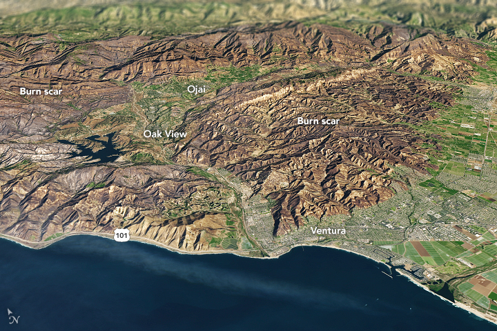
It is rare for large wildfires to burn in California in December, which is usually a wet month for the state. In most years, a few hundreds acres might burn. The 2006 Shekell fire in Ventura charred 13,600 acres, making it the largest December fire in the state between 2000 and 2016.
In 2017, the Thomas fire shattered the record for December and may soon eclipse the worst blaze in any month. After burning for 16 days, the massive fire had scorched 272,000 acres (110,000 hectares or 425 square miles) and was just 60 percent contained. That made it the second largest fire on record in California, trailing only the Cedar fire, which burned 273,246 acres in 2003.
The Operational Land Imager (OLI) on Landsat 8 captured an image of the Thomas fire scar on December 18, 2017. The natural-color Landsat 8 image was draped over an ASTER-derived Global Digital Elevation Model, which shows the topography of the area. The fire raged first near Ventura, then burned the hills around communities of Ojai and Oak View. Firefighters put up a fierce fight and managed to prevent flames from descending into the valley towns. Flames then pushed west toward Summerland, Montecito, and Santa Barbara. As of December 20, the fire was still spreading along the northern edge of the burn scar.
Authorities reported that more than 1,200 structures—most of them in Ventura County—have been destroyed. Several factors came together to make the blaze difficult to control. An usually wet winter and spring in early 2017 caused vegetation to flourish. Then the dry season turned out to be excessively dry, and rains also have been scarce in the typically wetter months of November and December. All of that vegetation dried out and was primed to burn. Once the fire started, warm temperatures and unusually fierce Santa Ana winds caused the fire to spread rapidly.
After nearly two weeks of red flag conditions, a break in the weather has allowed firefighters to beat back the flames in the past few days. But fire officials still do not expect the Thomas fire to be completely contained until January 2018.
-
References
- AccuWeather (2017, December 20) Why the devastating California wildfires have been so unusual, extreme this December. Accessed December 20, 2017.
- InciWeb (2017) Thomas Fire. Accessed December 20, 2017.
- Los Angeles Times (2017, December 30) Another day of reckoning: Return of powerful winds make Thomas fire dangerous again. Accessed December 20, 2017.
- NBC (2017, December 19) Map: How the Thomas Fire Grew Into One of California’s Largest Wildfires. Accessed December 20, 2017.
- The Wrap (2017, December 11) How They Saved Ojai: A Letter From a Town to Its Firefighters. Accessed December 20, 2017.
NASA Earth Observatory image by Joshua Stevens, using Landsat data from the U.S. Geological Survey and ASTER GDEM data from NASA/GSFC/METI/ERSDAC/JAROS, and U.S./Japan ASTER Science Team. Story by Adam Voiland.
- Instrument(s):
- Terra – ASTER
- Landsat 8 – OLI
NASA: A Chilly End to 2017 for the Northeast
Saturday, December 30th, 2017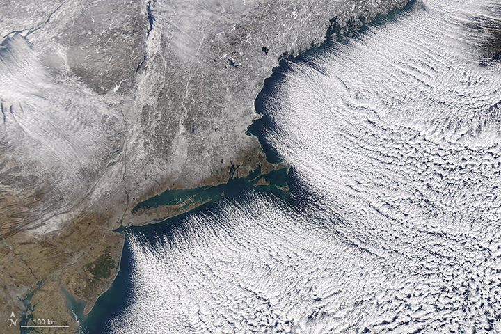
As 2017 drew toward a close, Arctic air spilled into the eastern United States and Canada for several days. Blasts of bitterly cold air set up a white Christmas for many Americans, and forecasters are expecting New Year’s Eve celebrations to be the coldest in recent memory for many areas.
The Moderate Resolution Imaging Spectroradiometer (MODIS) on NASA’s Terra satellite captured this image of the frozen Northeast landscape on December 28, 2017. Brisk northwesterly winds created rows of “cloud streets” as cold air blew over Lake Ontario and the Atlantic Ocean. A layer of snow covered much of New England and upstate New York.
Cloud streets are long parallel bands of cumulus clouds that form when cold air blows over warmer waters and a warmer air layer (temperature inversion) rests over the top of both. The comparatively warm water gives up heat and moisture to the cold air above, and columns of heated air called thermals naturally rise through the atmosphere. The temperature inversion acts like a lid. When the rising thermals hit it, they roll over and loop back on themselves, creating parallel cylinders of rotating air. As this happens, the moisture cools and condenses into flat-bottomed, fluffy-topped cumulus clouds that line up parallel to the direction of the prevailing winds.
While the cold streak has not broken all-time records, it is breaking records for individual days. On the day the image was acquired, weather observers on Mount Washington (New Hampshire) recorded a daily record low of -34 degrees Fahrenheit (-36° Celsius). Baltimore, Boston, Flint, New York, Montreal, and Toronto Cities have seen records fall during this cold snap.
When the ball drops in New York City on New Year’s Eve, forecasters expect air temperatures of 10°F (-12°C), with wind chills of -5°F ( -15°C). The last time it was so cold was in 1962; the record for the coldest ball drop occurred in 1917, when the air temperature was just 1°F (-17°C), according to Jason Samenow of the Capital Weather Gang.
The cold weather pattern has its origins in a large bulge, or ridge, in the jet stream that has brought unseasonably warm weather to Alaska. On the east side of this ridge, a trough in the jet stream plunged southward, bringing plenty of Arctic air with it. This orientation of the jet stream, which looks similar to the greek letter omega, is known as an omega block.
-
References and Further Reading
- Forbes (2017, December 28) A Response For People Using Record Cold U.S. Weather To Refute Climate Change. Accessed December 29, 2017.
- Mashable (2017, December 29) There’s no end in sight to the frigid weather in the U.S. and Canada. Accessed December 29, 2017.
- The Boston Globe (2017, December 28) Mt. Washington summit breaks daily record low. Accessed December 29, 2017.
- The Washington Post (2017, December 29) Eastern U.S. to endure most numbing New Year’s Eve cold in memory. Accessed December 29, 2017.
- The Weather Channel (2017, December 29) Arctic Cold Outbreak to Bring Record Lows to the Plains, Midwest and East Into the New Year. Accessed December 29, 2017.
- Weather Underground (2017, December 25) Almost Half of the Lower 48 States Had Snow Cover Christmas Morning 2017, Including a Rare White Christmas in Seattle. Accessed December 29, 2017.
NASA image by Jeff Schmaltz, LANCE/EOSDIS Rapid Response. Story by Adam Voiland.
- Instrument(s):
- Terra – MODIS
9/28/17: Puerto Rico Landscape Ravaged by Hurricane Maria
Thursday, September 28th, 2017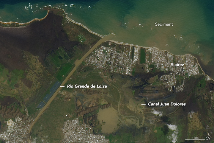
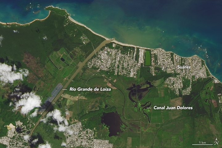
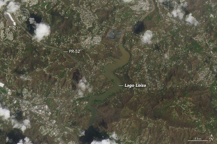
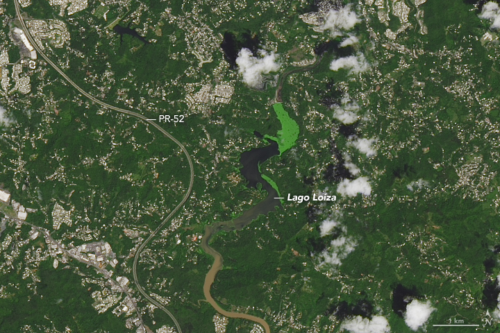
Hurricane Maria tore across Puerto Rico on September 20, 2017, ravaging both urban and rural areas with category 4 winds and intense rainfall for several days. Most of the electric power grid and telecommunications network was knocked offline; towns both inland and at the coast were swamped with floodwaters and storm surges; and the lush green landscape turned brown from damaged vegetation and mud and debris deposits.
On September 26, 2017, the Operational Land Imager (OLI) on the Landsat 8 satellite captured some of the first natural-color satellite images of Puerto Rico after Hurricane Maria. Cloud cover is common in the tropics and has been particularly bad in the days since the storm, so researchers have been unable to see much from orbit.
The images above show the Rio Grande de Loíza, the island’s largest river by volume, where it meets the Atlantic Ocean several miles east of San Juan and west of Suárez. The images below show an interior portion of the island around the Lago Loíza reservoir, south of San Juan and north of Caguas. In each pair the second image shows the same area one year ago (September 23, 2016) so as to provide a proper seasonal comparison. (Note: the green color of the lake in 2016 could be an algae bloom or some other form of water vegetation.)
NASA’s Disasters Program has delivered to the Federal Emergency Management Agency (FEMA) a map of areas in eastern Puerto Rico that have likely been damaged as the result of the landfall of Hurricane Maria. The “damage proxy map” was created by the Advanced Rapid Imaging and Analysis team (Jet Propulsion Laboratory) and derived from synthetic aperture radar images from the European Space Agency’s Copernicus Sentinel-1A and Sentinel-1B satellites.
The National Oceanic and Atmospheric Administration is making aerial surveys of the U.S. states and territories affected by hurricanes Harvey, Irma, and Maria. Click here to see photos as they become available.
-
Related Reading and Resources
- NASA (2017) NASA Earth Science Disasters Program. Accessed September 27, 2017.
- NOAA (2017) Assessing Maria’s Destruction from the Air. Accessed September 27, 2017.
- FEMA (2017) Hurricane Maria. Accessed September 27, 2017.
- CNN (2017, September 26) ‘Apocalyptic’ devastation in Puerto Rico, and little help in sight. Accessed September 27, 2017.
- Good Morning America, via Yahoo News (2017, September 25) Chopper ride over Puerto Rico shows ‘unprecedented disaster’ after Maria. Accessed September 27, 2017.
- Mashable (2017, September 26) Photos reveal dire situation unfolding in Puerto Rico after Hurricane Maria. Accessed September 27, 2017.
NASA Earth Observatory image by Joshua Stevens, using Landsat data from the U.S. Geological Survey. Story by Mike Carlowicz.
- Instrument(s):
- Landsat 8 – OLI
- Landsat 8 – TIRS


